Tutor Report Form
Student name: Simon Allard
Student number: 487150
Course/Module title: Printmaking 1
Assignment number: 2 – First Relief Prints
Overall Comments
You’ve made some beautiful very varied lino cut prints here, where your subject matter really compliments this process. Your notes and commentary throughout show your learning journey, where you are constantly assessing your strengths and weaknesses. I love the way you set off your prints to the full advantage by mounting them…all ready to go in a frame and hang on your wall! Very well done Simon.
Feedback on assignment
Project 5
Your two test cut prints have used a good selection of cutting techniques. It’s great to change the way you handle to the cutting tool; rocking it, applying varying amounts of pressure or changing the direction you cut. The first test cut is not as full of contrast as the second, and both would benefit from having an even layer of print transferred to the paper. I notice you have used different inks to see which is more successful, and the linseed oil has helped as an addition to the Deka inks. It’s really important that all the textures and marks created with the tools are allowed to show of without the distraction of textures appearing due to the roll up of the plate; you could rub a little harder on the back of the paper in areas, using a spoon or your fingers, and just lift a little corner to see how it’s going as you go along. If it needs more burnishing in one area you can assess and focus on that specific area. The second test cut also shows more use of pattern, shape and suggestions of tone, which can be used for further prints in the future. There are many here that can be translated into a landscape composition or still life – representational or abstract.
Project 6
Your black and white photos that inspire this series of prints are wonderful. They really allow you to focus on a particular aspect of your subject in detail, and identify areas of form and tone. Your pen studies are an ideal starting point for these prints and could easily form the basis of many more prints to come made through a number of processes. I like the way you have decided that the headstones in the graveyard would be ‘white’, with the surrounding negative spaces black – so the tipex on black paper was a perfect way of visualizing this! I also like to use Parker Quink ink in black or blue and paint directly into it with bleach…it works in a similar fashion and gives some beautiful results.
The paper you’re using to print on is a nice thick, smooth white cartridge – it would be good in the future when you start to use other papers (thin Japanese papers are lovely for block printing), both white and coloured if you could make a note of what they are on the back of each print. Print 1 shows the initial design, but you’re right that the ink coverage is not uniform enough to really show off these shapes to their full. What sort of rollers are using and are you back using the Ocaldo block printing inks? Print 2 is getting better, apart from the talk accident! Print 3 is stronger still…as finished prints I think they stand firmer on their own, but it’s interesting to see them so close together on this sheet. The colour is more of a brown umber than a sienna brown like the others, and I prefer it many ways. The coverage is denser and flatter and therefore allows the shapes to really start to take on a life of their own – the light and shadows here are strong. The second generation or ‘ghost’ print (very apt!) could be lovely background setting for an overprint of monoprinting or back drawing. I often encourage students to use these ghost prints to play with other ideas, the texture on the stones here reflects their nature well. The most successful of these prints is definitely the one you have chosen to mount. The ink transfer is perfect, with good clean edges. It’s worth leaving an extra centimeter around the image to allow you to sign, date and title your prints, and maybe even identify it’s order in an edition if you where to make one. If it’s a proof print before the edition you can right I the left have bottom corner A/P (Artist Proof). You could experiment with printing this in different colours to see how the atmosphere and feel of the print alters.
The subject matter for you second single colour print is very powerful and resonates much similarity with the drawings and prints of Henry Moore – do keep this dialogue up with regards to relating your ideas to other artists that may help inspire you. Your studies and drawings explore line and form in a loose, free and expressive way compared to your last designs. What a wonderful imaginative way you’ve bought the relationship between line, form and space. I love your mask – many artists have used maquettes to help inform their paintings or prints. Naum Gabo, Ben Nicholson and Anthony Caro spring top mind. I wonder what this would look like if you used paper that had been printed on…just a thought! You could also photograph it with varying light sources, changing there direction to change the way the shadows form and give greater idea about tonal contrasts that may feed into your prints. Your little colour studies are good, with the zooming in to a specific small area of the mask…. viewfinders of different shapes and sizes are very useful to make out of card or paper. You have noted that the colour prints on printed on hot-pressed watercolour paper – it reminds be of Somerset paper, or Fabriano…both fantastic printmaking papers. BFK Rives is another good universal paper and I find Great Art Mail order to be of best value – they also sell other papers like thin silk fibred color paper, and sell a very good range of inks and rollers. The watercolour washes created a good background of colour – this can also be achieved with a monoprint plate of glass or Plexiglas acrylic sheet – you also have the option to wipe into the ink and make marks if you wished. I sometimes use coloured drawing inks to prepare some backgrounds for my prints – very intense string colours. I’m not convinced that these prints are ideally suited printed next to each other like this though. Also, because the ink transfer is not flat enough in areas, with the blotchiness of the coverage, the image isn’t done justice. You have cut the mask shape well, but there needs to be something more – it may be that it would look stronger if you’d cut out the negative space and left the positive to print. Some cutting marks are present in areas, which detracts from the aim of the flat shape. It’s very 2-dimensional due to its flatness; some contrasting small cuts to other areas in the background, or actually within the mask itself may have helped give it more form and presence. I’d like to see it printed just in black, or a sepia brown or yellow ochre, which would solidify it more and give it’s organic natural feel. It could be portrayed as rusty metal, liking back to the caged grave. The mounted print works well on it’s own and you have made room for your signature – this print has more impact than the previous, but the green is still not dense enough. Is the ink starting to dry, and how often are you needing to add the linseed oil –how does this help when inking up? The green and yellow here really complement each other and the print is well registered over the yellow background.
Project 7
Your multi-block print is well composed; you have really thought about how the eye will read this design, like a map or jigsaw, each element has it’s part to play overall. Printed on an off-white paper is good idea; it would soften the feel and complement the earthy tones. With each block you have realised which areas need more cutting away; again you are aiming for very flat blocks of shape and colour, with little or no room for pattern or texture. This is fine and it works well, however what I particularly like about your preparatory work here are the pen and ink studies that show many lines drawn in different directions to depict the different layers of the walls and buildings – line is used to show texture and structure, and this could effectively be used in the design. The stencil is lovely too – this could certainly be used as a stencil with monoprinting as you’ve done in the last assignment. A photocopy and carbon paper is ideal to transfer your image on to the plate as you found. Print 3 has been redesigned a re-cut, but I’d love to have seen the other 2 prints too! I would like to have seen three very different impressions of your 3-colour print – perhaps using completely different contrasting colours using different papers. Your test prints here can act as the 3 prints – you have changed the tones in certain areas, and they show your developing understanding of light and dark, and how you might try and create a sense of the three dimensional out of a very two dimensional plate. The test prints also show you using a few more papers – Fabriano takes the ink well here. The buff paper certainly acts as another tonal part of the print and I think this is the most striking and successful print. Your final mounted print is strong and well registered. You have developed a good mid tone here that compliments the yellow and brown. Sometimes in your sketchbook it’s worth checking your colours out first, using your finger to dab some of the ink onto the paper, to make a little swatch of colours together. A brown or cream mount would be far better too. You have worked really hard on developing this print and it’s due to you practice and patience that it has come together. I can almost sense it would benefit from a fourth layer in black maybe, to define the forms even more and add a little texture or pattern.
Learning logs/critical essays
I’d love to see a little more research information relating to other printmakers that use lino as their medium, and some more notes. Your sketchbook and logbook have become one, which does work, but you may find it useful just to do an overall synopsis at the end of each project. This could include subheadings about subject matter, materials, tools, processes, decisions made and why, strengths and weaknesses. It would allow your prints and drawings to sit in their own right without too many notes and would give some structure to your discerning observations and reflections.
SUBSEQUENTLY I CONTACTED NIKI AND REMINDED HER THAT I HAVE BEEN KEEPING THIS ON LINE LEARNING LOG. SHE SAID SHE HAD FORGOTTEN AND WOULD REVIEW IT AND LET ME HAVE SOME COMMENTS TO PASTE INTO THIS PAGE.
Suggested reading/viewing
I found a few artists whose work you might be interested in looking at!
www.artshole.co.uk/rachelwinsley.htm
Orchid Park Studio (secondary school) – www.opps.edu.sg
www.angielewin.co.uk
www.jimmywilling.com
www.chrisbourkeart.com/portfolio/lino-prints/
Other
Tutor name: Nichola White
Date 17th November, 2010
Next assignment due Jan/Feb 2011
skip to main |
skip to sidebar
by Simon Allard, monoprint in oil and water based inks

This is my record of learning and development on an Introduction to Printmaking course completed through the Open College of Arts.
Links to separate pages
- Home
- Tutor Report from 9th September 2010
- Notes on Assignment 2 (from 14.10.10 onwards)
- Tutor Report from 17th November 2010
- Notes on Assignment 3 (31st January 2011 onwards)
- Tutor's Report Assignment 3 - 27th May 2011
- Notes on Assignment 4 (from 29.05.11)
- Tutors Report Assignment 4 (11th July 2011)
- Notes for Assignment Five
- Project 15- Final Four Prints
- Tutor's Assessment for Final Assignment
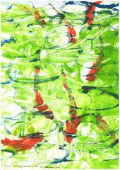
Gold Fish
by Simon Allard, monoprint in oil and water based inks
Followers
About Me

- Smon Allard OCA Learning Log
- Married to a teacher, two 'grown up' children, used to be a bank manger but I'm alright now.