For the third module on advanced relief prints I have decided to do a series of 5 prints. I printed 7 just to allow for errors and used 3 sheets of some highly expensive BFK Rives paper. I used some white cartridge paper and a sheet of Saunders Waterford hot pressed paper just because I had it and wanted to use it up. I used colours plus a final black in a reduction lino cut. For the first print I planned to use process yellow, the second a violet and the third a rusty brown. I did a separate print as a single colour at each stage so that I could analyse the coverage/quality etc. I used Calligo ink to start with but it had gone hard so I moved to using a DEKA yellow which worked the first time but then went thin, probably because I hadn't let the block dry properly after I had cleaned it withwhite spirit.
The prints on the expensive BFK Rives paper all came out relatively well (thankfully). But the prints on the Saunders water colour paper didn't. I don't think this paper is particularly good for printing as it has quite a pronounced texture which can only have very specific uses.
Good points from cut One
The template I made from a big sheet of card with registration marks for A4 is working well.
The 100 or so Christmas cards I printed have honed my printing skills even if it was boring! I am getting a much better uplift of ink from the block to the paper.
Cut Two
I decided to print the rusty brown next rsther than the violet because I wanted it to be the main colour and it is the most descriptive colour for rusty metal. Unfortunately the first print gave a red colour so I mixed some yellow into it and it became a dark orange rather than a rusty brown. It looked quite interesting but not how I imagined. I was then not sure what to use as a third colour. The quality of my printing was still good.
Cut Three
I did the reduction and decided to mix up a dark reddy brown for the third colour but wasn't sure how to do this with the inks that I have so I decided to use my ordinary oil paints as ink and add extender. This turned out well and gave a transparent coverage especially when the surplus ink was lifted off using paper after printing.
I used some of my worst prints to experiment on with dabbed blocks and this gave some interesting and useable effects. I think using oil paints as ink will only work in certain circumstances such as printing over areas of colour already printed with conventional ink.
At this stage I was getting disappointed with the project which wasn't working as I had imagined.
Final Cut 4.2.11
I did the final cut and printed the black which rescued the image partially. I thought bits of it were very effective, mainly the iron work but it was the background and the textural effect I had used to get the pebbles on the beach that was too frenetic with too much white and too much process yellow. I felt a flat blue greay as a background would have been better. I tried subduing the background with water colour just to see what would happen but it didn't work.
See Critical appraisal on main page.
5th March (Three Men in a Boat)
On reflection the rusty shackle print failed because I hadn't tried and tested my colours and design thoroughly enough in advance of printing and so I decided to do a further small print but work everything out first.
I chose an image of three men in a boat that I had extracted from a Monet Oil painting and I did colour notes and experiments before printing.
I made a template out of card to ensure the registration was accurate and then used a strip of lino approximately a quarter the size of the final print and printed a flat block with cobalt blue oil paint as ink at the top of the paper to represent the sky. I printed up 4 prints.
I let the prints dry and moved the lino down but still overlapping and printed the next block in yellow ochre. I repeated this process with aturquoise green and finally overprinted some darker, wave like marks under the place where the boat would be.
I chose to use oil paint as ink again because I wanted a transparent effect with the boat and three men done opaquely over the top. By overlapping transparent colours I got other colours where the two combined which I haven't yet been able to achieve with printing inks.
I found rollering the edges of the flat blocks difficult so I cut strips of lino which I placed either side of the block to act as rails along which the roller passed thereby ensuring an even coverage to the block I would be printing from.
30th March 2011
I cut the intial block of lino to represent the men in the boat and stuck it to a piece of card that was an exact fit for my template. I chose three colours, starting with a warm yellow, then a rusty brown and finally a really dark brown. I had cut away lino in between each colour.
The finished print worked pretty much as I had planned although the shadows of dark green under the boat were too vague and if they had been given more form they would have aided the recession.
I was initially unhappy with the ambivalence of the horizon and thought I should add some distant boats in dark brown but I have come to quite like the fact that the position of the horizon is unclear.
I think if I did this again I would do it larger so that I can get more details into the image such as light reflected off the shoulders and heads of the rowers and the oars and gunwales. I could also turn the boar round so that it is rowing away and the denote bow waves which would give some movement to the image. All in all there are things here I could take further.
skip to main |
skip to sidebar
by Simon Allard, monoprint in oil and water based inks

This is my record of learning and development on an Introduction to Printmaking course completed through the Open College of Arts.
Links to separate pages
- Home
- Tutor Report from 9th September 2010
- Notes on Assignment 2 (from 14.10.10 onwards)
- Tutor Report from 17th November 2010
- Notes on Assignment 3 (31st January 2011 onwards)
- Tutor's Report Assignment 3 - 27th May 2011
- Notes on Assignment 4 (from 29.05.11)
- Tutors Report Assignment 4 (11th July 2011)
- Notes for Assignment Five
- Project 15- Final Four Prints
- Tutor's Assessment for Final Assignment
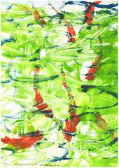
Gold Fish
by Simon Allard, monoprint in oil and water based inks
Followers
About Me

- Smon Allard OCA Learning Log
- Married to a teacher, two 'grown up' children, used to be a bank manger but I'm alright now.