Self Appraisal - Having now completed this project I have four contrasting prints on different papers which I have selected from the total of ten printed. My original idea was to take the words from a song 'And every leaf that falls becomes the quiet earth' and produce a poster to illustrate this. The idea came from my visit to the Langemark cemetery for German soldiers killed in World War One which is designed to embody the very germanic idea of death being part of the cycle of life as leaves and bodies fall to the forest floor to feed the growth of new trees and vegetation.
I wanted to use a lose monoprint for the background 'forest' then overlay a series of flat lino prints employing the reduction method to portray falling leaves and soldiers. I succeeded in producing prints that did this and I succeeded in meeting the requirements of the project but as usual I am far from happy with the results:
Print One - This is one of the prints using the reduction method but one of the first I did before I started reducing the sky line with each block. In my notes you will see that I had a lot of trouble with the lettering and had to change my idea from crisp black lettering to a more weathered lettering because the block kept moving if I rollered it too much. The lettering in this print is probably the best of any, the background is a strong orange and the coverage of the ink from the blocks is fairly even and consistent. The balance between the monoprint and lino is cohesive. My big criticism though is the dimpling of the last black lino print which comes from over inking. I found it impossible to get a flat black when printing onto three previous layers of dried ink.
Print Two - This is the best of the reduction lino prints. I applied the orange to the bottom of the mono print using a roller and so the orange of the falling soldiers is a flat colour of even consistency. The top 'tree' section is less bold than the other similar print from this series and whilst the lettering is slightly too faded in appearance it seems to work with the background. The last black printed layer is more consistent but still not completely flat.
Print Three - This is the print with the bright green background with what was supposed to be a diluted gold overprint. The lettering and the green work well and the marks of the mono print have a pleasing 'liquid' feel about them. However the green seems too strong to me and overpowers the gold. There are some interesting textural effects where the monoprint shows through the gold over print.
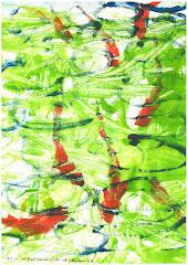
Print Four - This is my favourite of all four, the green and violet mono print background is quite an edgy combination of colours and the back drawing has given it a very interesting textural effect which works well with the weathered lettering. The dark green overprint whilst not complete in coverage, is flat and un dimpled. The approach to this print was much more spontaneous than the laboured process of continually reducing the block, taking prints and waiting for the ink to dry before doing it again.
I think Print Four has more of the qualities you would expect a combined mono and lino print to have.
This was a difficult project for me, I feel I was probably a little too ambitious in what I wanted to do especially with the lettering which I thought would be so simple. I over complicated the print with the overlaying of four reduced lino blocks. however the images I have produced are thought provoking and attract attention. The best bit for me is the design of the skyline using the negative shapes of leaves in the two reduction prints.