I wanted to become a printer and now I feel I have made a start. It has taken me two years to finish the course and looking back to when I started it my life was completely different. I then slipped a disc in my back necessitating two months off work, I was made redundant and had to find a new job, which meant commuting to London again but throughout it all I kept printing.
I felt my initial tutor was unhelpful and only seemed to answer my queeries with one line e mails so I changed tutors and have been very lucky with Niki who takes a lot of trouble reviewing my work and provides comprehensive feeback that I have found invaluable.
Because Printing is technical it has been quite hard teaching myself from the written materials rather than having access to a print studio with a tutor to show me how to do it, this has made me inventive in coming up with solutions and I am very independant as a result. I'd like to compare my work with other peoples work though and maybe I will get a chance at some point. The experience of being in a group would have been a bonus and would've made the course richer. But I have a day job so it's a question of what is possible. I may book myself onto a residential course in some aspect of printing at some point.
I have found it difficult to track down the work of contempory printers other than on the internet although I have managed to get to about three print exhibitions. The work on display always seems to be a bit conventional for my tastes as I definitely like painterly prints and painterly printers have been hard to find. The Bankside Gallery near the Tate has become a favourite gallery and is home to the Painter Print Makers Society. I am the only printmaker in our local art society and I think I need to join a printmakes group if I can find one that will have me.
But the positives far out way the negatives and I am so glad to have been able to find a new way of articulating my creative ideas and one that presents so many fasci nating alternatives and oppportunities to explore.
I am pleased that this course has made me serious about printing. I'm interested to see how my printing influences my watercolours when I start painting again because I have not really done any watercolours for the past two years.
My biggest regret is that I haven't related my work to the work of well know printers and when I do printmaking at the higher level as I progress towards my degree this is something I must address.
I do all my printing in a shed down the garden which has not been ideal and I crave a proper studio with a press and drying racks etc etc. I will now pack up my shed for the winter and contemplate my next move.
Thursday 15 September 2011
Tuesday 13 September 2011
Evaluation of Project 15


The inspiration for this series of four prints came from the German War Cemetery at Langemark and the sculptures of four faceless soldiers who stand vigil on the edge of the plot looking in. I each of my final prints I have tried to capture a different aspect of the original place.
In print One I tried to capture the sense of longing for home that the dead will never see again and the restlessness of spirit this caused in me.
In print Two I wanted to explore the decorative possibilities of the image. Even sculptures at cemeteries have decorative possibilities.
In print Three I wanted to show the hewn and crafted quality of the sculptures and how the act of their creation provides a continuity with the past.
In print Four I have hinted at the dark side of a small plot of land in Belgium, containing the bodies of 40,000 men and the sinister 'faceless' quality of the sculptures.
I feel my most successful print is Print Three because it largely achieves the objectives I set out with albeit via a less successful prior series of prints. I truly love the fact that you can see how I have stuck two blocks of wood together to make one block that isn't quite square and doesn't quite fit the A3 box it has been put in. I feel a bit like that myself sometimes. I like the way the grain goes in a different direction for each half of the block and the way the surface of the wood has torn where I have gouged accross the grain. I sometimes think there's a craftsman in me trying to get out rather than an artist, perhaps that's why I have been drawn to printing which in some ways is a bit of both.
Apart from the quality of carving in Print Three it is quite a clean print with some good technique used to effect. The different printing processes ie. momoprinting with stencils and wood cut relief compliment each other so where there is texture from the mono printing there is solid colour from the relief print which creates a satisfactory balance between lose and solid.
The colour scheme works but could be more adventurous as I have used these sorts of colours in other works.
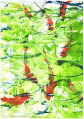
I am least happy with Print Two because I have only partially resolved the dilema between texture and form that I wanted to get nearer to solving at the outset. Of the three versions of this print I like the one above best because it has a colour scheme that is at once bright but seems to reflect the vigourous gestural mark making and backdrawing, It is a vigourous print, perhaps at odds with the sombre mood of the original setting which may be another reason why I like it the least.
Print One is the most interesting and unexpected with it's simple white on black statement. I don't think I could've taken this any further in any direction. I like the battered and weathered look of the printing contained in the outline of the figures which was something I strived for at the outset. I like battered, worn, weathered things in general; again they speak of the passage of time and provide a link with the past. I find this continuity reassuring.br />
I'm afraid to confess that print Four was like going through the motions a bit. I could've been more adventurous with colour and the chine colle and the collagraph but I stuck to the things I knew would work, mainly because I am running out of time to get this course assessed in the November assessment and thereby get back on track.
Looking at the series of prints as a whole I think they hang together as a body of work mainly because the underlying design is so simple. Also they are all A3 which helps. Even in Print Four you can see that it is generated from the earlier print so there is a connection.
I have used every printing technique covered in the course except multi block releif printing. This was a hard project and I take satisfaction in finishing it.
Thursday 1 September 2011
Project 14- Chine Colle


I decided to use the original single colour lino cut I did of Brompton Cemetery earlier in the course as the basis of my chine colle print series. I realised at the outset that the solid block of colour in the background would detract from the effect I wanted to get so I striated it with a lino chisel to get a hatched effect.
I had planned to use copper and gold foil together with some delicate Indian tissue paper with strands of fibre embodied in it. I wanted to get a highly decorative and visually rich effect and yet not lose the compositional strength of the original photo and lino print. I wondered if the tissue paper I was using was too subtle.
I started by mono printing a pale blue on eight sheets of paper using a stencil cut the same size as the lino block. I varied the marks I made so that some went in the same direction as the striations on the lino block and some went in the other direction. I was very much aware of the problems I had had with the background in my original Reduction Method print of the iron shackle where I had used a cross hatched effect for the background and it had been too busy and had failed. I resolved to make the marks more more 'whippy' and random. On some I rollered a flat colour onto the plate without textural mark making. I used three different varieties of cartridge paper and the last of my expensive BFK Rives paper.
For the over print I started by using a bright warm red but as I progressed with the series I greyed it down using blue so the colours changed throughout the series. I had no idea what I was going to do with the foil or bits of paper and I hoped that would become clear as I evolved the series.
I had already worked out from my working drawings that using the copper and gold foil was extraordinary fiddly and difficult to get a satisfying effect with. I found that using ordinary kitchen foil, which was thicker and screwing it up and then unscrewing it was more effective. I also found that the use of distressed kitchen foil became focused on the cross in the foreground and the overprinting of blue/green greys onto it was particularly pleasing.
I used the Indian tissue paper randomly and to no effect and stopped using it in favour of orange tissue paper which gave some really interesting mid tones where it crossed areas of the paper that had not been printed on. I tried to make the application of the orange tissue paper match the shadows but the shapes I had to cut out were so complexed that I simplified the shapes and created an almost abstract effect that broadly corresponded with the shadows. By this time I had used up all my eight prints and yet I felt I was really getting somewhere so I started another series which I initially mono printed as before.
I had run out of expensive paper by this time and resorted to good quality cartridge paper for all of the final series as I could discern no advantage to using expensive paper although I did feel that one of my earlier promising prints had suffered by being printed on cheap thin cartridge paper.
In my second series I wanted to explore the use of the orange tissue paper to support the shadows in the original composition but I also wanted to explore the use of kitchen foil on the nearest cross. Fairly early on I found that the tin foil worked best if it was cut exactly to the shape of the cross rather than as an abstract effect and I began to wonder if my Indian tissue paper might've worked if it had supported a compositional element in the print rather than just being used in an abstract way.
I tried various shapes using the orange tissue paper until I was getting the sort of half and half abstract/figurative effect I was looking for. In the final print I used the tin foil cross, the semi abstract orange tissue paper shadows and also I cut out the exact shape of the furthest cross in Indian tissue paper to see if it worked that way. I peeled the paper away from the block with eager anticipation and revealed probably my most successful print to date.
Appraisal
Half of what I wanted to do I had planned in advance and half evolved as both series went on. This working method allowed me to respond to what arose rather than being bound by preconceptions and I welcomed this freedom.
The brief was to produce a series of four prints incorporating chine colle techniques in different colour schemes, on different papers incorporating metal foil, thin papers and other materials and I have met these requirements.
I wanted to produce prints that were highly decorative and visually rich but which supported the compositional strength of the original lino cut. I think the combination of the silver foil with the light blue ink has the sort of opulent, far eastern feel and richness I was looking for and the overprinting of a darker tone on the nearer cross adds a further dimension that speaks of the intricacy of the original stonemason's work and the the delicate tracery of his carving. There is an overall sense of fine, expensive craftwork in some areas.
The Indian tissue paper in the final print enhances the exotic atmosphere and the suspended fibres add interest upon closer examination without detracting from the compositional strength of the piece as a whole. Where the orange tissue paper has been used to create subtle mid tones it is more abstract but never loses the connection with the shadows and thus works within the figurativeness of the image. However I love the tension between abstract and figurative in this part of the work.
I am pleased with the final print. This is one of the rare occasions on this course when a print or series of prints has met my expectations.
Monday 8 August 2011
Some printmakers I have found


I've been thinking about my final series of prints and looking around for work of other printers that I like. Here are some:
They are.... Headstone by Jai Llewllyn(etching )Winter scene by Ros Morley (etching and chine colle) The Hotel Room by Phil Cosgrove (monprint) Red Brow and Shadows by Glynis Porter (woodcut and lino cut).
Friday 5 August 2011
A brief history of wood block printing


I've taken most of this information from various articles on Wikipedia so it's not an accademicly referenced essay, merely a quick whistlestop tour for my own benefit.
The rolling of cylinder seals onto clay tablets began in Mesopotania c3000BC but woodblock printing with a strong buddhist connection, on cloth and paper, appears to have come from China in the 3rd or 2nd centuries BC. The earliest woodblock printed fragments of silk, depicting images of flowers, date from before AD220.
In Europe woodblock printing developed several centiries later than Asia. It is unclear if Egyptian printing of cloth was learned from China or elsewhere or developed separately but by the 9th and 10th centuries Arabic Egypt was printing muslim prayers. Europe adopted woodblock printing from the Muslim world initially for printing decorative designs on fabric.
It seems that the development of moveable type in China in the 11th century, initially using type baked in clay and metal moveable type invented in Korea in the 13th century, led to woodblock printing of text being discontinued in Islamic Central Asia.In India woodblock was always mainly used for printing decorative textiles.
In Japan woodblock printing of Buddhist texts dates from 764AD to 770AD and moveable type was only introduced from Korea in the 1500's so there is a body of work and a strong tradition of woodblock printing in Japan.
As a method of reproducing text, wood block printing was overtaken by moveable type and printing presses, although in 15th century Europe illustrated woodblock books were printed as a cheaper alternative to moveable type.
The greatest artist of the northern Renaissance, Albrecht Durer (1471 to 1528) revolutionised the potential of the medium with his wood cuts such as The Four Horsemen (shown).
It is also worth mentioning that woodblock printing of French wall paper became famous at the end of the 18th century.
Sunday 31 July 2011
Project 13 - Combination mono and linoprint


Self Appraisal - Having now completed this project I have four contrasting prints on different papers which I have selected from the total of ten printed. My original idea was to take the words from a song 'And every leaf that falls becomes the quiet earth' and produce a poster to illustrate this. The idea came from my visit to the Langemark cemetery for German soldiers killed in World War One which is designed to embody the very germanic idea of death being part of the cycle of life as leaves and bodies fall to the forest floor to feed the growth of new trees and vegetation.
I wanted to use a lose monoprint for the background 'forest' then overlay a series of flat lino prints employing the reduction method to portray falling leaves and soldiers. I succeeded in producing prints that did this and I succeeded in meeting the requirements of the project but as usual I am far from happy with the results:
Print One - This is one of the prints using the reduction method but one of the first I did before I started reducing the sky line with each block. In my notes you will see that I had a lot of trouble with the lettering and had to change my idea from crisp black lettering to a more weathered lettering because the block kept moving if I rollered it too much. The lettering in this print is probably the best of any, the background is a strong orange and the coverage of the ink from the blocks is fairly even and consistent. The balance between the monoprint and lino is cohesive. My big criticism though is the dimpling of the last black lino print which comes from over inking. I found it impossible to get a flat black when printing onto three previous layers of dried ink.
Print Two - This is the best of the reduction lino prints. I applied the orange to the bottom of the mono print using a roller and so the orange of the falling soldiers is a flat colour of even consistency. The top 'tree' section is less bold than the other similar print from this series and whilst the lettering is slightly too faded in appearance it seems to work with the background. The last black printed layer is more consistent but still not completely flat.
Print Three - This is the print with the bright green background with what was supposed to be a diluted gold overprint. The lettering and the green work well and the marks of the mono print have a pleasing 'liquid' feel about them. However the green seems too strong to me and overpowers the gold. There are some interesting textural effects where the monoprint shows through the gold over print.
Print Four - This is my favourite of all four, the green and violet mono print background is quite an edgy combination of colours and the back drawing has given it a very interesting textural effect which works well with the weathered lettering. The dark green overprint whilst not complete in coverage, is flat and un dimpled. The approach to this print was much more spontaneous than the laboured process of continually reducing the block, taking prints and waiting for the ink to dry before doing it again.
I think Print Four has more of the qualities you would expect a combined mono and lino print to have.
This was a difficult project for me, I feel I was probably a little too ambitious in what I wanted to do especially with the lettering which I thought would be so simple. I over complicated the print with the overlaying of four reduced lino blocks. however the images I have produced are thought provoking and attract attention. The best bit for me is the design of the skyline using the negative shapes of leaves in the two reduction prints.
Thursday 21 July 2011
Response to Tutors Notes on Assignment 4


I read my tutor's notes on the collagraph assignment several times because there were several things in them I found thought provoking. The assigment was a difficult one for me because I enjoyed it emmensely but failed to produce any work that looked like 'a proper print'. Nichola mentioned my 'painterly style of printing' and I think that is a good way of describing quite a lot of my work.
Maybe my idea of what 'a proper print' is needs to broaden?
I looked at the work she sugested: 'Fissure' by Karl Weshke and 'Composition' by John Wells, also 'Harbour' by Alexander Mackenzie (all detailed here) and I had a sudden insight into a different kind of printing, maybe abstract or semi abstract, maybe using texture and colour in an expressive and free way and I suddenly felt very excited about using the techniques I have explored to date in such a way.
I am currently doing the combined mono print and lino cut module of Assignment 5 and will then do a Chine colle module but in the final module I am encouraged to explore all the techiniques covered in this course to produce a series of prints. I think this would be a good opportunity to let rip!
The prints Nichola suggested I look at also reminded me of work by Robert Motherwell and Peter Lanyon (detailed here) and I will immerse myself in more of the same as preparation for my final work.
Wednesday 29 June 2011

Collatype print series - Bunker, Hill 60 (critical appraisal)

I was so enthusiastic about collatype printing that I decided to do another series based on a photograph of a World War One bunker located at 'Hill 60' (because it is 60 metres high) that I had taken whilst on my tour of the battlefields and graveyards'. This man made hill exchanged hands several times during the war and several VC's were awarded as a result of different offensive and defensive actions. In the end the hill won and I can imagine it soaked in the blood of both sides.
What attracted me to it was the symmetry of the white paths around it and the rugged mass of it's structure bullet riddled but defiant. I could imagine the soft flesh of the soldiers breaking and disintegrating as they were thrown against it. The lush surrounding vegetation and the peaceful birdsong also seemed incongruous against the knowledge of it's history and yet those bodies had been subsumed into the very soil that nourished such a verdant location.
I used the same textural surfaces as in my Spencer series but experimented in the way I inked up the blocks. On some I smeared diluted inks of different colours and then partially wiped some off and on others I used a roller. I also tried over printing areas of the bunker with a light blue to create a third colour where they overlapped. I don't think this was successful but it's a valid technique that I will experiment with in the future.
One side of the path around the bunker I did in a blood colour to represent the blood of the soldiers and then the other side of the path I did in yellow mainly to try and lift the picture. Throughout I was keen not to stick rigidly to the tonal values of the original photo and only loosely to stick to the colours, I was more interested in the mass of the bunker, the interlocking path shapes and the sensuous riot of texture in the foliage.
I planned most of it thoroughly apart from the yellow path which might or might not be a failure. The finished series of four prints are all different because I tried applying different inks in different ways with each one. I chose to use cartridge paper because I have found it to be more resilient if rubbed when wet and I wanted a crisp whiteness to reveal the textures.
I don't think the series is outrageously successful although it is very interesting and unlike anything I have ever done before. I hadn't realised texture could be so seductive. I found myself trying different things and peeling back the paper in anticipation of new discoveries each time and thoroughly enjoying the whole process.
I aimed to show the mass of the bunker which I feel I only partially achieved. I aimed to show the interesting geometry of the paths around the bunker which was more successful but still could have been more geometric. I aimed to show the riotous texture of the foliage and in this I feel I was most successful.
I think overall I lacked clarity of objective. I had in mind a sort of Graham Sutherland semi organic, semi geometric abstract and maybe I should have gone more abstract but in the end I tried to do too much and the message is consequently confused; is this a print of a bunker or a textural abstract? Actually there is probably too much texture and it would have been better to contrast some of the textural passages with some lino blocked areas of solid colour.
I felt drawn to collatype throughout this assignment and may well combine it with other techniques in my final series of Assignment Five.'
Stanley Spencer Arrives in Heaven

I still had Cookham, Spencer and the World War One artists in my mind when I was thinking about an image for my collatype print series. It occurred to me that I could take Spencer's painting 'John Donne Arrives in Heaven' and do a version of it with Spencer arriving in heaven to be greeted by angels. The iconic image of Spencer pushing his push chair through Cookham seemed appropriate. I decided to create the angels by drawing them into filler and printing them in intaglio but in a vague dream like way. By accident some of my test prints using carborundum on plywood had created some interesting contrasts between the texture of the plywood and the the texture of the carborundum and I could sort of imagine the exposed plywood being a slightly comic little man. I experimented with these combinations and evolved a stencil shape to represent Spencer. I printed the angels first on soaked Somerset paper in a landscape format and did about five. I chose a gold brown colour using burned Sienna and some yellow Occaldo oil based inks. I wiped the ridges of the block and pushed the paper down into the troughs with my fingers on the back of the paper. I was quite pleased with the effect and let them dry.
I cut out my stencil from cartridge paper and placed it on my ply wood and then covered the whole with PVA, sprinkled carborundum on it and removed the stencil. When it was dry I covered it with blue ink diluted with oil using an old hog hair brush. I added more colour to make the ink slightly violet as the series progressed. Finally I back drew the wheels of the pushchair with a blunt pencil and on one even experimented with back drawing around the stencil image, this was a complete failure but has an attraction and I will use it as a technique at some point in the future.
I didn't like the finished image. The comic image of Spencer didn't say 'Spencer' and it didn't work in landscape. Also I began to think the whole idea wouldn't work because it was all too vague.
I had a rethink and decided to use a tracing of Spencer pushing his pushchair that I had on a postcard I bought whilst in Cookham. I cut a small paper easel which would appear white on the finished print. I made a block out of cardboard and placed the stencil of Spencer on it then covered the whole with PVA and sprinkled carborundum all over it then removed the stencil. When it was dry I inked up the block using oil based ink diluted with vegetable oil as I had run out of Linseed oil and then placed the easel stencil onto the inked block. I had run out of Somerset paper and so I used tinted Ingres pastel paper soaked with a water spray and left between bits of blotting paper weighted down for about five minutes. I used the same colours as before and the same method and block for the angels but this time done portrait.
This image worked better and I achieved a measure of success I believe, there is a ghostly feeling to the image of Spencer and where the vagueness of the angels is matched with the vagueness of Spencer the prints achieve a certain cohesiveness. The warm angels on buff tinted paper contrast the cold blue/violet image of spencer.
Descriptive statement of Collatype boards
The A3 plywood board had 16 different items stuck to it but I found that only about three of them appealed to me: the filler, the bubble wrap and the screwed up water colour paper coated with PVA. I subsequently tried another board with filler drawn into it with a palette knife and with wire wool coated with PVA. The wire wool definitely had potential.
My tutor mentioned using carborundum powder and I researched this on the internet and bought some coarse grained and fine grained and experimented with this sprinkled onto PVA and mixed with PVA and applied with a knife. I did several test prints using carborundum and really enjoyed the subtlety of the effects I got, it has so much potential.
To summarise, the different surfaces I decided to use were:
1. Screwed up water colour coated with PVA
2. Wire wool coated with PVA
3. Filler drawn into with any sharp object like a nail
4. Carborundum, sprinkled onto PVA or mixed with it and applied with a knife
I also experimented with using stencils to block out carborundum leaving the texture of the plywood block exposed. Around the edges of the stencils there was a ghostly white line where the paper accommodated the slightly raised surface of the paper stencil.
The different textures from the above surfaces ranged from tiny dimples with carborundum to highly complexed ridged textures from wire wool. There were also subtle differences between filler drawn into and PVA/carborundum mix spread and drawn into. The filler had harder edges as it dried quicker. The screwed up watercolour paper gave the texture of damaged concrete.
I found the textures I created to be highly tactile and seductive and I wanted to go on experimenting with combinations and applications and stencils cut and torn. This method of printing has enormous potential and I don't feel I will exhaust it in this course.
Monday 30 May 2011
A Crisis of Brilliance

The title of this post is not a reference to myself (!) but the title of a book by David Boyd Haycock about five artists who were fellow students at The Slade before the first war and how the events of the war shaped their work and lives. I read it shortly after returning from France and found it enhanced my understanding of the artistic milieux of that time considerably.
The five artists were, Paul Nash, Stanley Spencer, Mark Gertler, Richard Nevinson and Dora Carrington.
I knew quite a bit about Stanley Spencer and Paul Nash whose work has always interested me but the others were unknown to me. The most interesting thing was how much they all corresponded with each other. I wondered at the impact of the first showings in England of the Post Impressionist work on our Art establishment. It seemed like the five young artists were all cautiously deciding how to respond to these new French ideas and were very conscious of working out whether they were valid or not. There were other art movements, such as the Italian Futurists trying to seduce them from the true path of English art; whatever that was they were all unknowingly defining it.
The book portrayed a country with the masses seeking a greater voice in the wake of industrialisation but the Establishment nevertheless holding onto power to the extent that young men flocked to the call of the recruiting sergeants in their thousands. The acceptance of things as they were meant that new ideas were seen as a threat and this was the same in Art.
The five artists were the brightest talents of their generation, 'Les Jeunnes' as they were dubbed and the war changed them all. Even Stanley Spencer felt that his best paintings had been done before 1914, others like Nevinson did their best work as a war artist whilst Nash's war work was only occasionally equalled after the war.
There is a lovely excerpt from Spencer's letters about him sitting in a trench waiting to go over the top with the painting 'Swan Upping' sitting in his bedroom at home unfinished and him speculating as to how the NCO would respond to his plea to be excused from duty on account of a painting that needed finishing back home.
I revisited Spencers paintings and admired the draughtsmanship which whilst naive is incredibly precise and felt a need to strengthen my own drawing skills. I will do a drawing module after this print module.
Drawn by Spencer's work and with some time available on a bank holiday due to my collatype blocks being still wet with PVA, I took the opportunity to visit Cookham. I wandered round the village and went into the Stanley Spencer museum which had a lot of his drawings from the Clyde shipyards which were incredibly valuable and informative to look at. I spoke to the elderly lady on the desk who had known one of his daughters and I noted the name of his older brother Sydney on the village war memorial.
And as I paused outside his old house my mind went back to the graveyards in Belgium and France and I wondered at a world that existed without the knowledge of so much death.
War graves and battlefields


In May 2011 I went on a tour of the World War I war graves and battlefields of Northern France and Belgium. I had always wanted to visit these sites again after driving through northern France with my parents as a boy, on camping holidays and noticing the incongruity of the many cemeteries in an otherwise sparsely populated rural landscape. I remember thinking there were more graves than people.
My aim was to sketch and paint my way through the tour, taking photos, recording thoughts and emotions and then bring it all back home to see what I felt. The sketch book has become a sort of travelogue which is an interesting visual record but the emotional impact on me has a caused deep reflection that I'm not sure how to respond to with my art, but respond I will.
I won't record every detail of the tour but I will record two snippets. When I get my sketchbook back from my tutor I will also upload some of the sketches I did so that you can see how they relate to my subsequent work.
On the first full day we toured the battlefields of the Somme, Thiepval, Delville Wood and most movingly Newfoundland Park. Newfoundland park covers 84 acres of original trenches so you can imagine what it must have been like on 1st July 1916 when the first Battalion of the Royal Newfoundland Regiment advanced forward down the falling ground of no mans land towards the German trenches (still there) less than 100 meters away. 10 minutes before the advance the huge Hawthorn Mine with 40,000 lbs of ammonal explosive had been blown about 1 km away (read Birdsong by Sebastian Faulkes for details of the mines) . The commander of this sector thought that blowing the mine 10 minutes before the plan would be a good idea but in fact it merely alerted the Germans to the attack and of the 801 Newfoundlanders who went into attack only 68 were not killed or wounded.
This single action is seared into the Newfoundland consciousness, the park is maintained by the Canadian government for whom it is a national monument and the canadian students who act as guides consider it a great honour to be selected for the job. The impact on the small community of Newfoundland which is basically a bit of rock near Canada where there were more moose than people would have been devastating. God knows why they were even fighting in a war half a world away.
I hadn't realised how much this experience had affected me until later that evening when I was chatting over a beer with a guide from another tour. As the evening wore on he began to open up about his experiences with the Paratroop Regiment during the Falklands War and I mentioned that one of my school friends had been killed with the Marines at Goose Green. When I told him what I knew about Lawrence's death he said he had known him and started telling me details such as who his commanding officer was and what it was like. I hadn't thought about Lawrence for several years and this chance evocation of the past caused the floodgates to open and I was overcome by suppressed emotion to the point where I had to make hurried apologies and retire suddenly to my room. Luckily I didn't meet the ex soldier at breakfast the next morning.
The second 'snippet' was our visit to Langemarck which is the cemetery for the German soldiers who fought in that area. It affected me because of the very different style to the allied cemeteries in the area.
The cemetery is surrounded by walls and a moat with pollarded willows that punch the air in defiance or stand like mutilated limbs which ever takes your fancy. It is in two parts. In the first part are the graves of 10,143 men of which 3,836 are unknown and then immediately through the entrance is the mass grave or Kameradengrab of 24,917 men with 86 bronze pillars bearing their names. On the far side of the cemetery stand four brooding statues, the figures of their mourning comrades, small isolated clusters of crosses break the surface of the ground beneath the loft of oak trees like mushrooms on the forest floor.
In the second part of the cemetery, beyond the oak trees and three large concrete bunkers are the graves of a further 9,475 men. The total number of bodies, in this thoughtful representation of the life cycle of the forest is 44,292 and I found the imagery of 44,292 leaves falling to the ground to mould and give new life poignant and dark and in stark contrast to the antiseptically neat rows of white headstones in the allied cemeteries.
So a lot to think about all in all.
Sunday 29 May 2011
Royal Society of Painter/Printmakers Exhibition - Bankside


I went to the Bankside gallery next to the Tate for the annual exhibition of the Printmakers Society. It was much better than last year, although my appreciation of printing is possibly deeper having spent a year trying to do it myself. What I found most interesting was the fact that I was drawn to colourful relief prints rather than etchings or engravings and in particular the ones using an imaginative approach to the subject rather than being purely representative.
The only exception to my prejudice against etchings was 'A Glimpse of St Paul's which was a view of St Paul's through the silver birches outside the Tate with the millenium bridge in between. Some of the birches were warm orange and deep red with muted greys and yellows in the distance.
Another favourite was 'Missionary Plant and Pumpkin' by Carol E. Walkin which was a linocut an used muted warm greys and bright orange to depict the pumpkin. The missionary plant used a flat green but the shapes of the leaves were interesting as was the negative space.
Gail Brodholt also did some lovely linocuts of London. I bought these cards by her which show flowing lines and and an interesting palette which capture the emotion of the subject matter with their; cold blues, lime green and orange using heavy purple and black to pull it all together.
There were some interesting and originally composed linocuts of the city sky line by Janet Brooke and some colourful almost abstract woodcut and stencil prints by Peter Green.
Monday 16 May 2011
Project 10 - Appraisal 16.5.11


I chose to do a relief print of a large acrylic painting I had done some years ago (see smaller picture) and combine it with the image of the Uffington White horse which I felt would work well as a wood cut. I had really enjoyed working with wood cuts as a progression from lino in the experimental mark making section of this course.
I planned to do a 4 colour reduction wood cut A3 size. The wood cut would be used to depict the distant hills and horse with a framework of hedges surrounding the various fields. I then planned to use a different block exploiting a different textural characteristic for every field. This seemed like a good idea at the time but proved to be a time consuming and ambitious project with 12 separate blocks to prepare, register and print.
The time consuming bit was not the cutting of the large woodblock, which I did from a beautiful piece of beech laminate, but letting every print dry before printing from the next block.I did a series of 5 in total and each one has its own characteristics. The one I finally chose to mount was chosen mainly because the registration is better than the others and there are less finger smudges and stray bits of unwanted ink.
I wanted to convey the feeling of an ancient chalk landscape with the white horse in the distance and a chalk road taking the viewers eye through the texturally interesting landscape. I achieved this. The composition works well and whereas the original painting had no focal point at the end of the track, the white horse provided this in the print. I liked the sinuous line of the track and hedges and I particularly liked some of the shapes of the fields which were interesting in their own right.
It was surprising how inventive one can get when looking for interesting textures to print and my favourite was the reverse of a piece if lino using the coarse hessian to get the effect of a ploughed field. Other things I used were bits of rough cut timber and pieces of card painted onto with a hog hair brush.
Again, planning well with colour notes and experimental prints and drawings made the whole thing more successful but some of my failings included not keeping my hands clean and in poor registration. My printing technique is getting better but I really need to be more meticulous with the process and make sure the ink only goes where it is supposed to!
Whilst I am relieved that this final project in the relief printing part of the course is over I had hoped that my print might have a certain atmosphere but alas it doesn't. The quality of 'atmosphere' I am looking for is not there because the tonal values are not quite correct, the darks are too dark and the range of tones too wide. Had I kept to a lower tonal and chromatic key I might have achieved the effect I was looking for.
On the whole I like relief printmaking and particularly like working with wood.
Monday 7 February 2011
Critical appraisal of reduction lino cut in 3 colours and black


I have included the original sketches of the rusty shackle I chose to make a print from and I think it attracted me because of the subtle purple and rust colours and the interesting shape, I ignored the background (more on that later!)
I carried out a series of A3 drawings in black felt pen and some coloured drawings in an effort to sort out how I was going to print the image. I planned it but changed the plan several times in the process (see notebook) I think I made the right decisions because I was trying to rescue the print which I thought was not working out as well as I would have liked.
I decided to use a rocking motion with a large broad tool to create the texture of the pebbles in the background and on reflection this was a mistake. I also chose to do an initial print in process yellow which I thought would create a bright airy feel but actually ended up dominating the other colours. By removing so much lino in the background with my initial cuts I created too much white. I would have done better to use a subdued grey colour and only remove the highlights of the metal work with my first cut.
Also by using the rocking motion to create jagged, strict diagonal lines I have created an extremely lively background when it should be subdued.
Apart from the use of yellow the remaining colours worked well, I was particularly pleased with the use of oil paints as ink to print the rusty red colour which came out with a pleasant transparent quality which I will value in future prints.
I also feel the image could have been transformed if I had used one of my more lively sketches in felt pen rather than the sterile, almost mathematically produced drawings I ended up using.
I bought some BFK Rives paper and whilst it was lovely it was extremely expensive and I'm not sure it justified the expense. Fabriano seems a much more cost effective option and remains my favourite.
Of the eight original prints, I ended up with three that were of suitable quality and as the brief only required two I used one to experiment with subduing the background using watercolour washes. This was not successful.
In conclusion I have met the requirements of the brief and some of my print making technique has improved enormously, I was particularly proud of the orange print and kept an example as part of the work I am submitting to my tutor. But my design let me down.
What have I been up to then?


Since my last post I have been working on the Advanced Relief Print projects. I decided to spend at least a month just researching and working in my sketch book on the theme of erosion. This took me to an ancient Victorian cemetery and led to distressing bits of paper with bleach, it's still very much a work in progress but I used one photo from it, of an old rusty shackle, as the basis of my lino cut.
I have included the full entries from my note book as I completed the project, on a separate page.
My original thinking for choosing the theme of Erosion came from reviewing an old sketch book which had taken some black and white photo's of Brompton Cemetery and then extended with collage to cover A3 sheets (see pictures included). I liked the textural qualities I had created, the crumbling masonry, ivy and disfigurement of angels by the elements. When I tried to push these ideas in my sketch book I found it difficult and ran out of steam somewhat. I will come back to it later and may even use some of the images in my final relief prints.
I also felt that this course requires me to explore printmaking not themes like Erosion in an abstract way. That doesn't mean I shouldn't continue my sketchbook explorations as new ideas emerge but I shouldn't feel bad about using an image I generate simply for it's suitability as material for a print rather than to illustrate something I feel about 'Erosion'. In short the course is about Print.
Subscribe to:
Posts (Atom)